
Design and Brand at EmergeGen
At EmergeGen, our brand is bold, powerful, and playful — all at once. Soft corners and expressive illustrations meet strong, authoritative type to create a look that’s both approachable and commanding. We bring fresh energy and personality into the AI space.
Watch our brand video below.

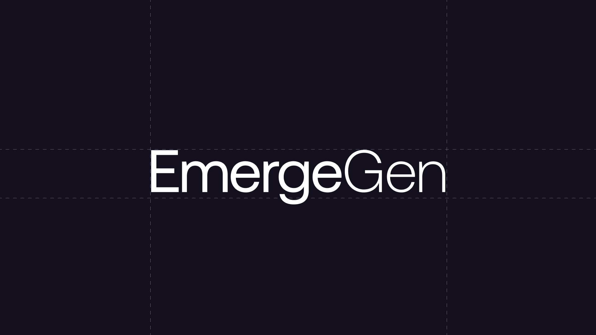
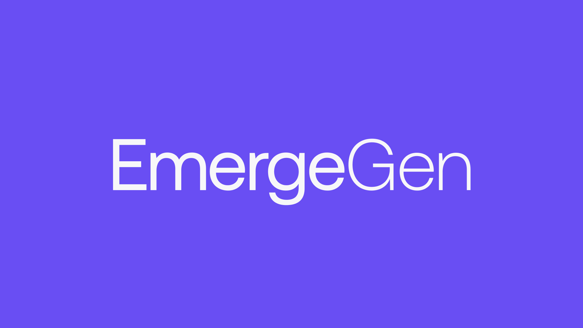
Logo
Our brand mark is a clean, straightforward wordmark that clearly communicates our name and creates an immediate connection with our product.
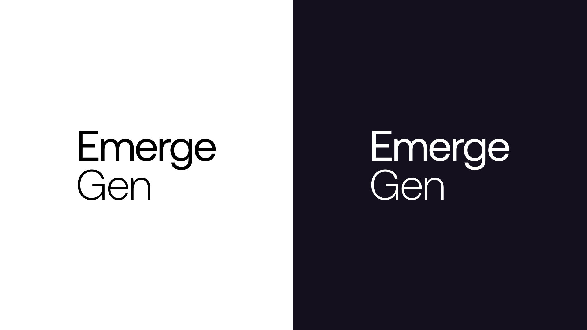
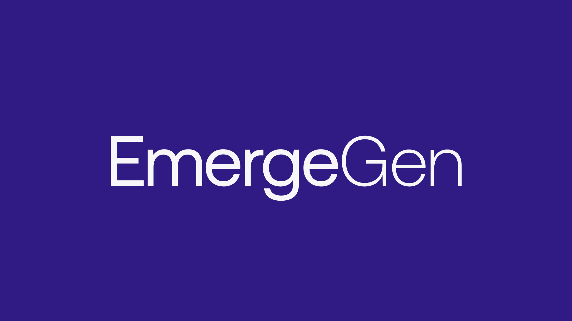
Logo Usage
We use two versions of our logo: a horizontal wordmark and a stacked version, designed for flexibility across different applications.

Colour
Our core brand color is purple, the foundation of our visual identity. It anchors the entire system, used thoughtfully across both light and dark modes. We apply it with restraint to maintain balance and impact. Explore below for a deeper look at how our color system comes together.
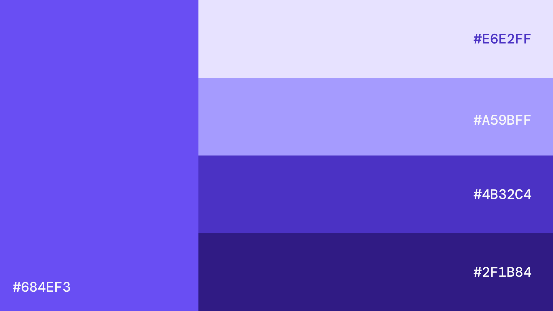
Primary Brand Colours
Our color system uses a five-step purple scale to keep the brand accessible and easy to apply. Purple 500 serves as the core brand color, while the rest of the scale provides flexibility across different patterns and use cases.

Token
Hex
Notes
purple-100
#E6E2FF
Very light lavender — backgrounds
purple-300
#A59BFF
Light tint — subtle fills, hover states
purple-500
#684EF3
Base — primary brand color
purple-700
#4B32C4
Deep accent — active/focus states
purple-900
#2F1B84
Very dark — text on light backgrounds
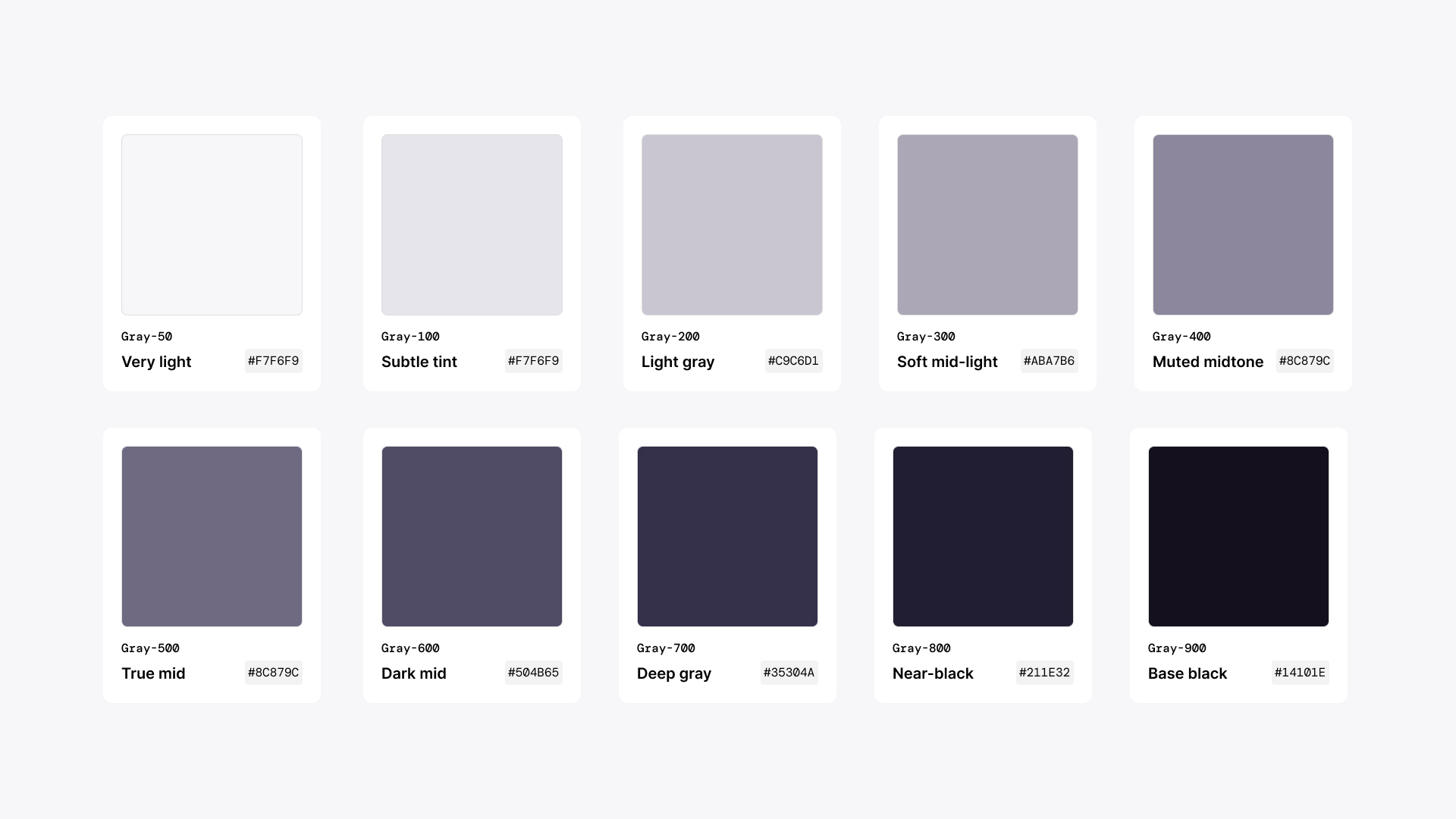
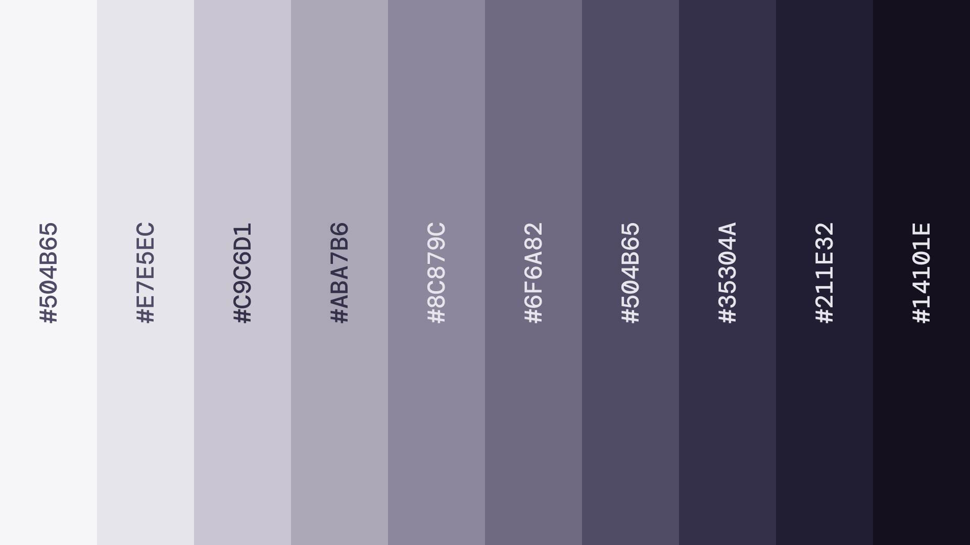
Gray Scale
Our grayscale follows a ten-step system, ranging from Grey 50 to Grey 900. Each tone carries a subtle hint of our core purple, created by desaturating the brand color to maintain visual consistency across the system.
Token
Hex
Notes
gray-50
#F7F6F9
Very light
gray-100
#E7E5EC
Subtle tint
gray-200
#C9C6D1
Light gray
gray-300
#ABA7B6
Soft mid-light
gray-400
#8C879C
Muted midtone
gray-500
#6F6A82
True mid
gray-600
#504B65
Dark mid
gray-700
#35304A
Deep gray
gray-800
#211E32
Near-black
gray-900
#14101E
Base black
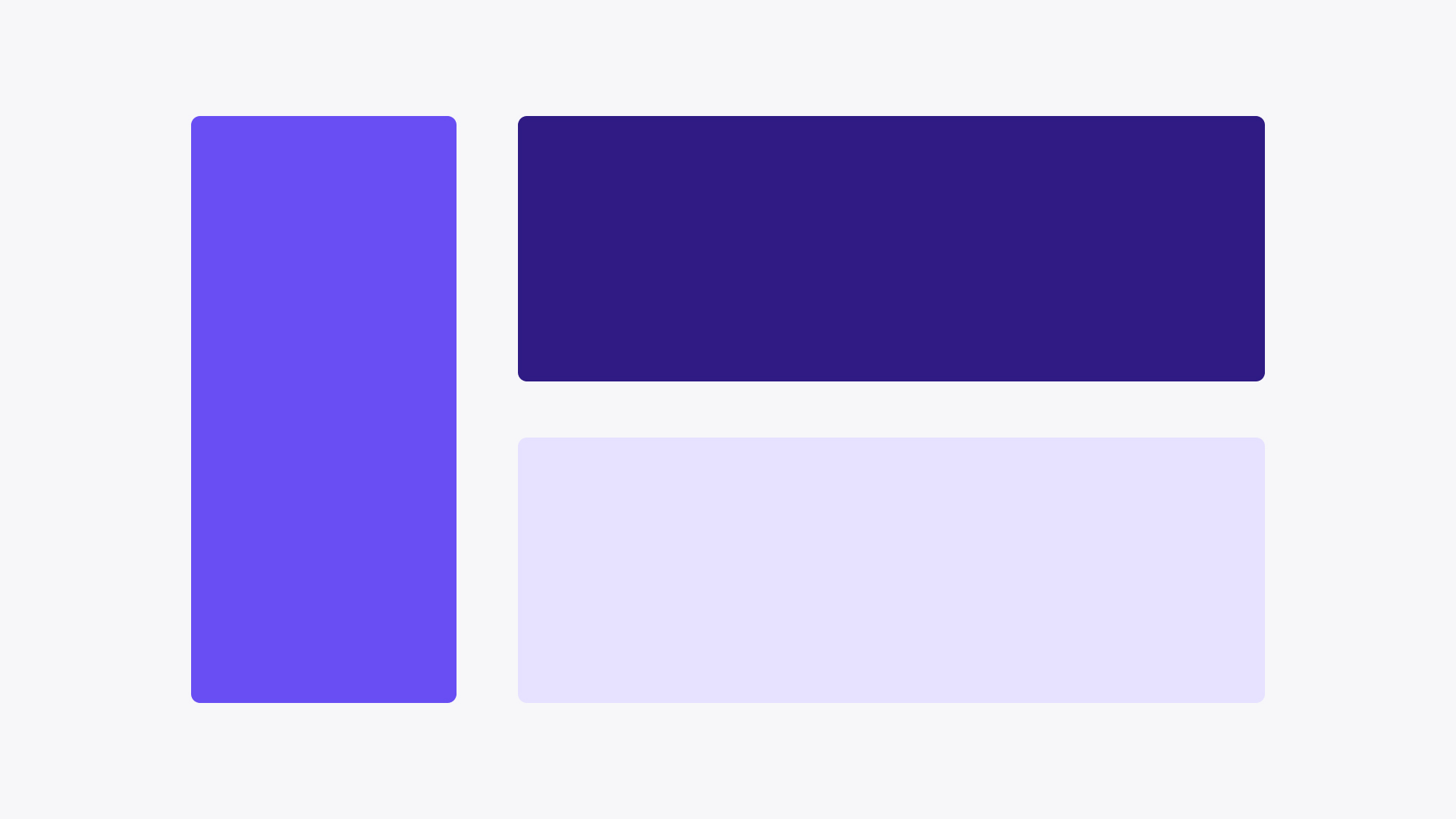
Colour Usage
Here’s a quick example showing how some of our color combinations work in practice.

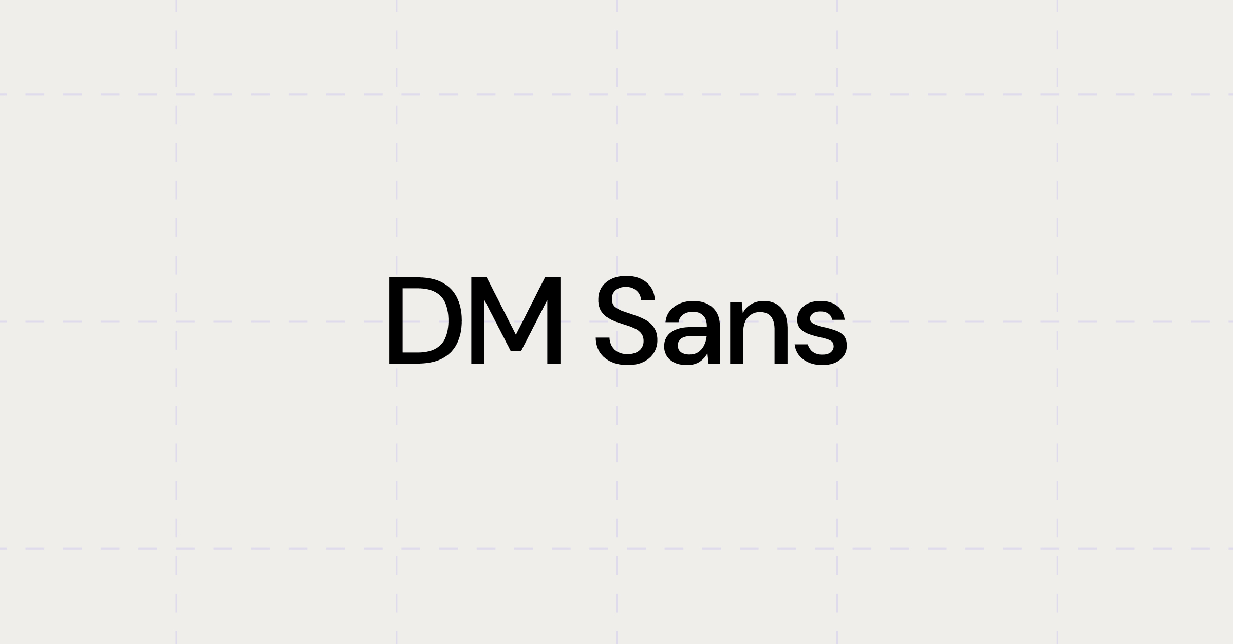
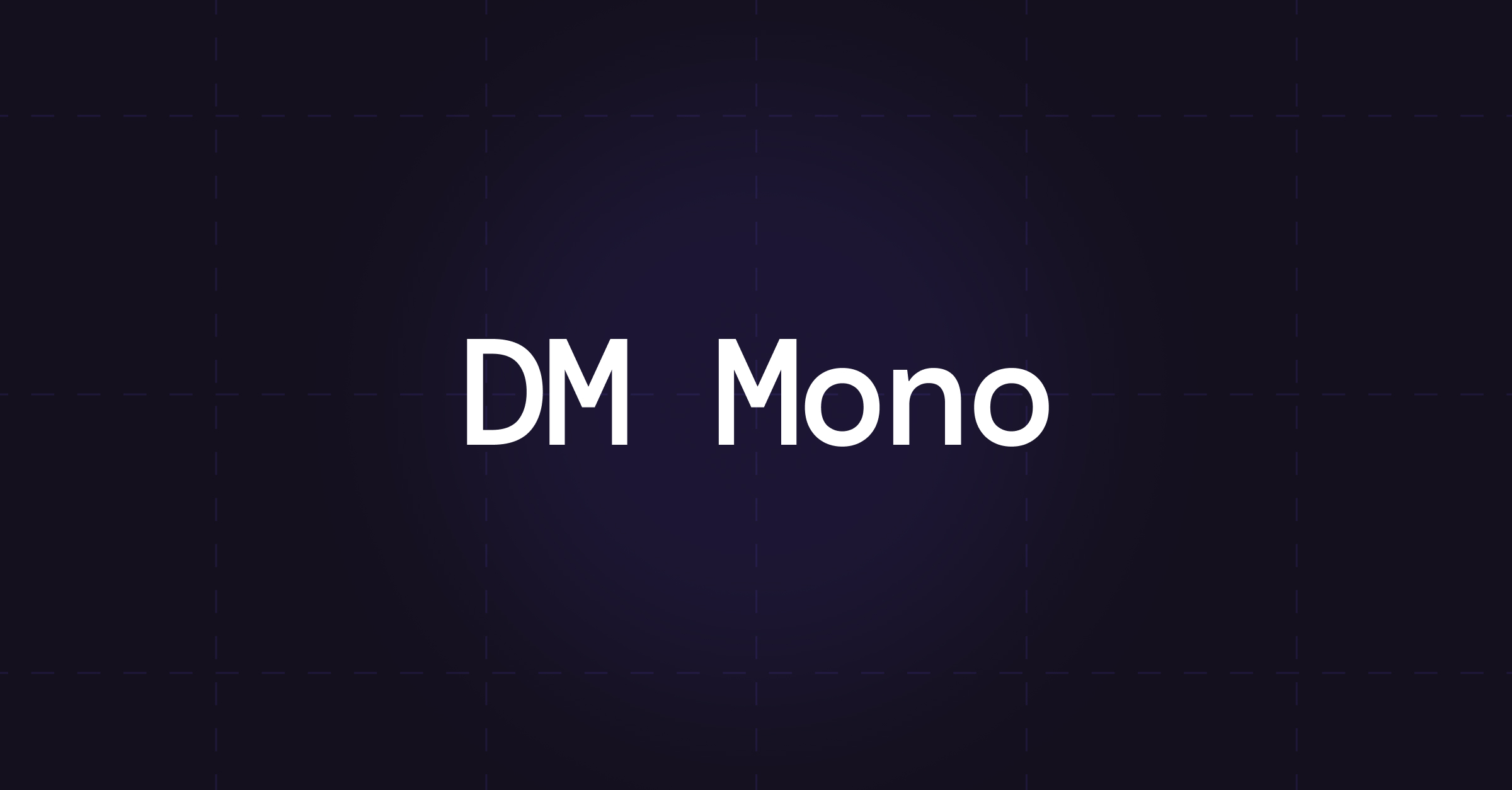
Typography
Our typography system is simple yet bold, combining DM Sans with DM Mono for specific use cases. Together, they give EmergeGen a distinctive voice in the tech space — confident, modern, and unmistakably clear.
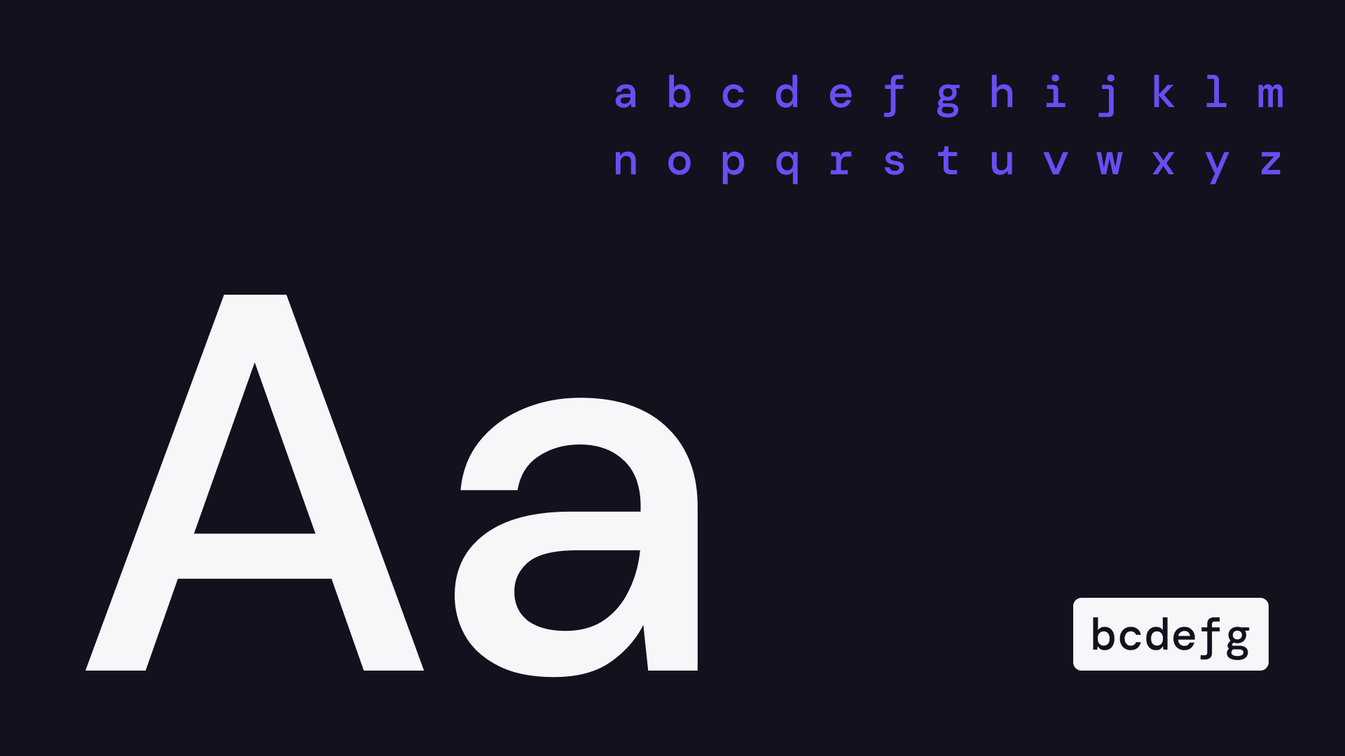
Type Scale
Below is our complete type scale, including the defined tokens used consistently across both marketing and product.
Token
Font Family
Weight
Size
Line Height
Use Case
type.display.lg
DM Sans
700
48px (3rem)
120%
Hero headings
type.display.sm
DM Sans
700
36px (2.25rem)
120%
Page headings
type.heading.lg
DM Sans
600
28px (1.75rem)
130%
Section titles
type.heading.sm
DM Sans
600
22px (1.375rem)
130%
Subheadings
type.body.lg
DM Sans
400
18px (1.125rem)
150%
Large paragraph
type.body.md
DM Sans
400
16px (1rem)
150%
Default body text
type.body.sm
DM Sans
400
14px (0.875rem)
150%
Small text, captions
type.mono.md
DM Mono
500
16px (1rem)
150%
Inline code, highlights
type.mono.sm
DM Mono
400
14px (0.875rem)
150%
Snippets, metadata
Brand Usage
Here are a few examples of how our brand comes to life across social media. Explore the rest of the site to see how we carry this identity through to our product.


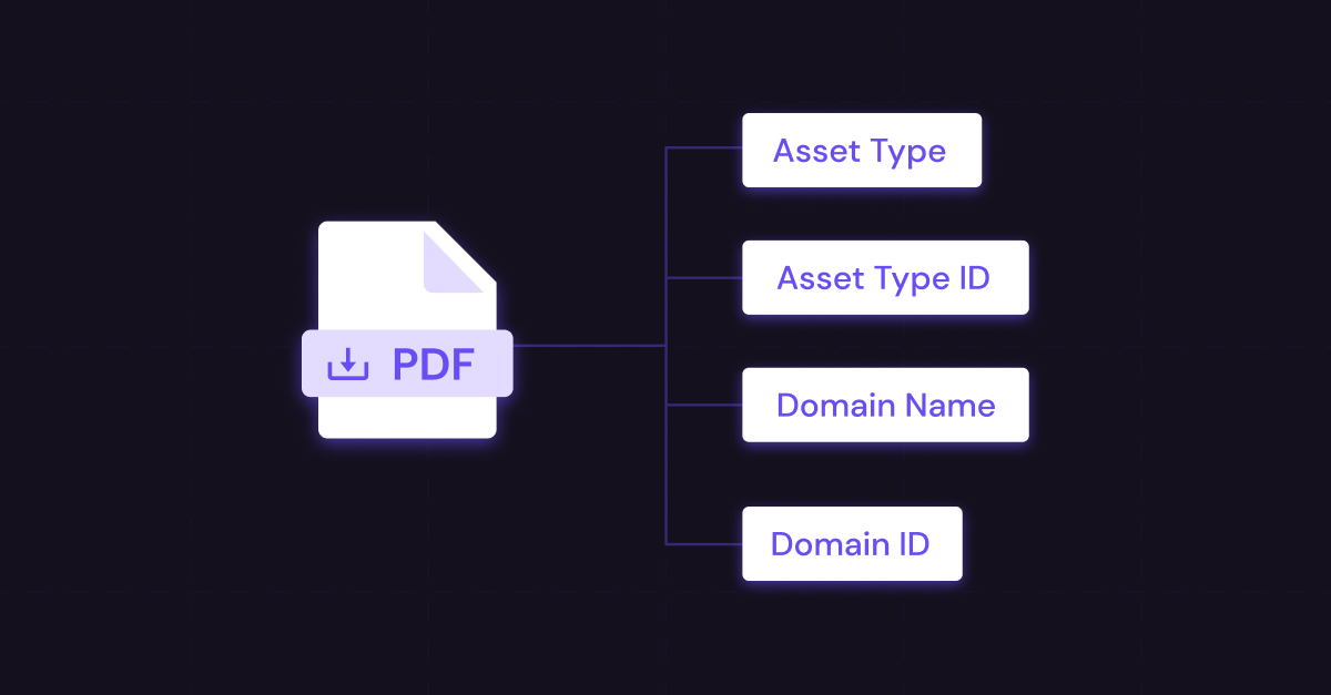

Download our assets
This Figma file provides the foundational design tokens and type styles used across our brand and product interfaces. It’s the single source of truth for our primitive values, ensuring visual consistency and scalability across platforms. You can also download our brand assets including the logos and iconography.